Coming soon!
Implementing a dark theme toggle with react-redux and styled-components
A quick google search shows that there are many, many great posts already covering the topic. However, to hone my skills, I decided to build it myself, from scratch.
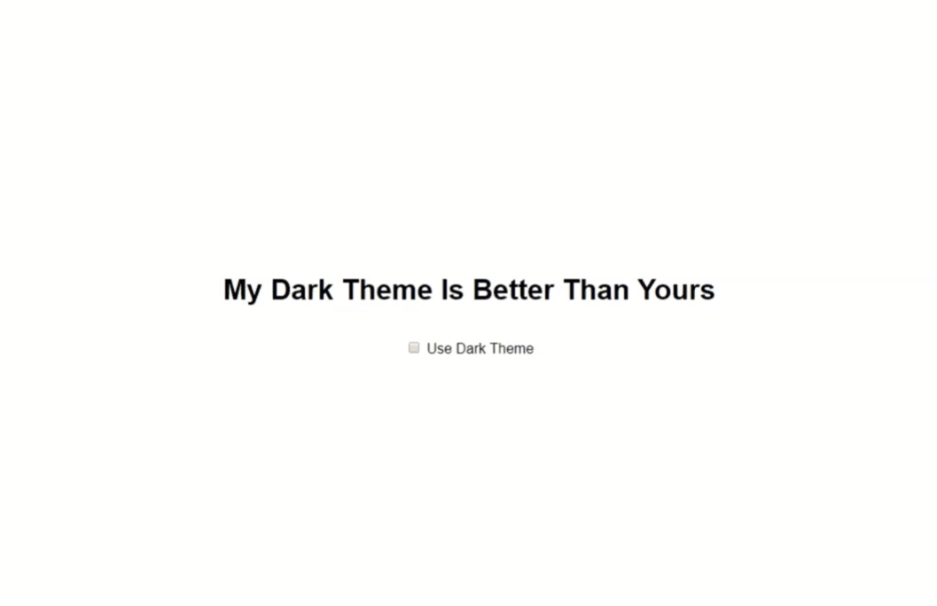
Here’s what we will build:
create-react-app
To keep things simple and concise, we’ll start fresh with npx create-react-app dark-toggle . While we’re in our command line, let’s get the npm packages out of the way as well:
npm install styled-components styled-theming redux react-redux
- styled-components: we’ll use this library to create isolated components that encapsulate their own styling
- styled-theming: this library offers a very clean API to work with multiple themes in your styled components
- redux and react-redux will do the heavy lifting regarding state management
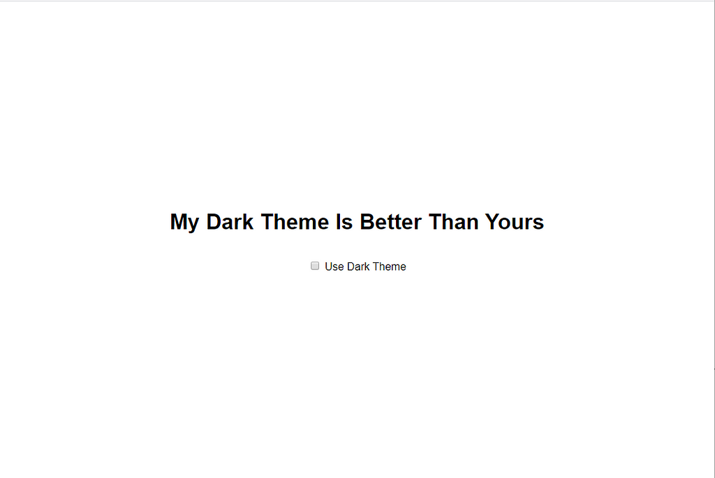
This is a first draft of our App.js, displaying the title and a checkbox:
Now, to provide a theme
We need to tell our component(s) how to style themselves based on the current theme.
Luckily, styled-components has built-in theming support. You simply wrap your components with a ThemeProvider component and a theme prop is made available to all of them.
This is what our updated App.js looks like:
Notice something strange? The object we passed to the ThemeProvider ‘s theme prop doesn’t exactly look like a theme. This is where styled-theming comes in. Instead of passing an entire theme object here, we pass the Provider an object with a property ‘theme’. In our case, possible themes are light and dark.
This object is arbitrary though. For example, in a multi-branded app, you could pass an object with a property brand, or even combine both of them (to support light/dark modes per brand). Let’s implement both themes in our app:
Take a moment to appreciate the neatness of the theme-api that styled-theming offers:
export const backgroundColor = theme("theme", {
  light: "#eff2f9",
  dark: "#2d2d2d",
});
const Container = styled.div`
...
background-color: ${backgroundColor};
`;
This api makes it dead-easy for components to alter their styling based on what theme(s) is/are currently active. Using our multi-branded example again, maintaining your different styles is a lot easier this way (plus, it is still entirely up to the component to style itself).
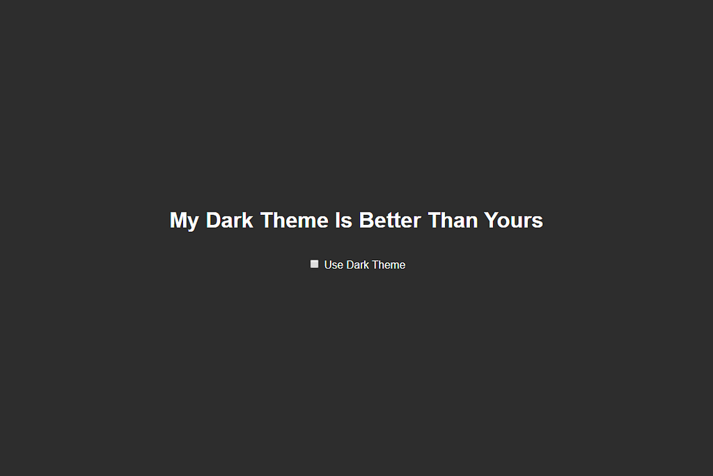
Change the theme you pass to the ThemeProvider to see the different styles:
Good, our ThemeProvider simply passes down a denotation (an object which we can construct however we see fit) to our components to tell them what styling is currently active.
Through a very clean theme api, our components decide what styling to apply, based on the object passed by the ThemeProvider. Now, on to the checkbox!
Enter react-redux
To implement the toggle-functionality, we need a place to store the currently selected theme and a means to toggle it. Ideally, this should be available throughout our application. This is where react-redux comes into play.
Admittedly, for our simple app, redux is very much overkill. However, I plan to use redux for my state-management later on in this app, so let’s roll with it now.
There are three things we need:
- an actual store to hold the state
- an action to dispatch intent
- a reducer to handle that intent
That’s easy enough:
To use this store, simply wrap your App component with a Provider from react-redux:
DarkThemeProdiver
We need some way to connect the state in our redux store to the ThemeProvider wrapped around our app. To keep things clear, I’ve decided to introduce a separate provider which will handle just this.
Let’s take a closer look:
- we use the useSelector hook to get state from our store using a selector function
- we return our ThemeProvider and provide it with a theme based on the state in our redux store
Let’s update App.js so that it uses our newly implemented DarkThemeProvider:
Let’s toggle
Great! Now all that is left, is to dispatch the TOGGLE_DARKTHEME action whenever the checkbox is clicked. To do this, I’ve refactored the checkbox into a separate component:
The DarkThemeToggle component pulls the required state from our store, again using the useSelector hook. We also use another hook from react-redux called useDispatch. Whenever our checkbox changes, we use this to dispatch the TOGGLE_DARKTHEME action.
Finally, this is what the application looks like:
One more thing
There’s one last problem here though, and it’s a UX problem. Whenever I leave the page, it ‘forgets’ my preferred theme.
There are many ways to work around this, but I decided to store the selected theme in localStorage and rehydrate the redux store with it when the app launches.
The magic happens in the store.js file:
- when building the initial state for our store, we check localStorage for any stored themes
- we use a redux subscriber to update the localStorage whenever something changes to the preferences.
All done!
Thanks for reading! 👏
Implementing a dark theme toggle with react-redux and styled-components 💅 was originally published in Level Up Coding on Medium, where people are continuing the conversation by highlighting and responding to this story.

Looking for talent?
Fill in the form below and we’ll get back to you as soon as possible.
Oops. You seem to have written your full name in invisible ink. Please enter it so we can read it. Oops. You seem to have written your company in invisible ink. Please enter it so we can read it. It seems your e-mail doesn’t exist. Please enter a real one so we can contact you. Oops. You seem to have written your telephone in invisible ink. Please enter it so we can read it. Sorry, we could not send the enquiry.Please contact us at 03 294 17 41 or at info@team4talent.be